Designing a new Bundling Experience for TELUS customers
Overview
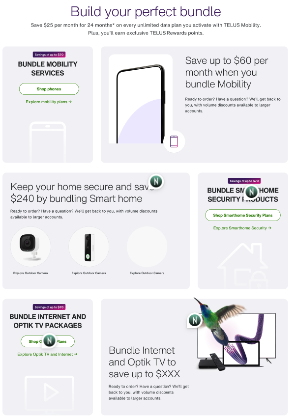
This project aimed to create a new bundles overview page for TELUS customers in Quebec who want to bundle their mobile and home services and learn about TELUS Smart home offers. I was tasked with integrating the existing Quebec ‘Regrouper page’ contents into a new URL managed by a Toronto-based team.
Tools: Figma, Miro, Google Meet , Google Docs
Design Kits: Universal Design System for TELUS
Detailed task flow diagrams were created to better understand the existing Quebec Bundles experience in the region. We collaborated with various stakeholders from the Quebec TELUS Marketing team to understand KPI’s, email campaigns, and user demographics. I also conducted a deep dive into the bundling experience for Quebec customers to better understand the shortcomings of the current design.
Discovery
Mapping the existing pain points
-
Previous QC Bundles ‘regrouper’ page linked to bundle builder page that allowed users to choose and select smart products and services to bundle, however, pricing information was innacruate and paged product cards were not maintained with the latest information
-
The old Quebec Regrouper page for bundles had an outdated design, and in addition to lacking visually, it also lacked any real UX strategy. It was basically just a big grid of links that had no real visual hierarchy or treatment.
-
The hero CTA on the old Regrouper age linked to an error 404 page, indicating a severe neglect of this web experience in Quebec. The bundle builder page itself was also restricted to users in specific regions, and if you were not in one of these regions, your journey could not continue (with no real feedback or communication to the user).
SCREENSHOTS OF THE OLD BUNDLES EXPERIENCE ARE BELOW
Performance of the previous QC Regrouper page was studied, after analytics were collected. These insights helped shape my understanding of the types of customers coming to this page, which would help me later with the content strategy and flow of the new experience.
Discovery
Analytics overview
Key Summary
Very low activity and poor engagement on the page
Many of the visitors were smart home customers and also new customers/prospect
No call data was being tracked
Competitive analysis was conducted to understand how other sites handled their bundles experience. This process allowed me to see common UX patterns across the telecom industry, and establish a starting point for the experience I was designing.
Discovery
Competitive analysis
Expand below to see common UX patterns discovered.
-
A common pattern found on competitor pages was plan cards being used to showcase the total savings a user would achieve by bundling 2 or more services.
-
A common experience from competitors involved providing a link for the customer to chat with a sales rep or e-rep to enable their new bundle service over the phone.
-
Many bundles pages seemed to have extensive links to customer support including: direct lines to support, store details, and e-agent chat links
-
Many pages included a section dedicated to comparing the different products one could bundle, and how it would benefit them
Wireframes were designed to layout the page’s story , and to plan how the form would be integrated into the experience - we knew that new customers needed to fill in a request for callback form in order to connect with a TELUS agent.
Design (Figma)
Wireframing layouts
Prototypes were created of the new experience based on mockups you can view below. These were created only using feedback from our stakeholders and colleagues, but had yet to be put to the test by real usability testers. Prototypes were animated and linked using Figma, as per usual.
Design (figma)
Prototyping flows
Design
Design mockups (pre-testing)


At the time of usability testing, the project scope involved only Quebec-native customers, as this was the key demographic who would be served the new TELUS bundles experience. We specifically tested with French-speaking clients to ensure that the translations of the copy were accurate, as we wanted to keep a French-first focus with this new design.
Research
Key findings from usability testing
-
● “Save $60/month by bundling your services” was the most attention catching part of the webpage.
● Absence of detailed bundle information was the most distracting part of the webpage.
● Some spelling/grammar issues and missing translations were noticed.
-
● Expect to see detailed information about bundles and the prices.
-
● Expect to see detailed bundle information, the ability to compare bundles, and the ability to sign-up for a bundle.Description text goes here
Design
Final high-fidelity mockups
The designs went through more iterations after the usability tests were conducted, and after more rounds of stakeholder requirement changes. The bundles page scope grew larger to include all regions in Canada, rather than just Quebec, and so the final designs were re-worked to include more variations for regionalization, as well as incorporated user feedback. Unfortunately, this experience was never able to benefit from a new bundle builder experience due to funding.
Business
Business benefits
data TBA.
Enhanced conversions
Improved Digital Experience
Consolidated digital experiences of QC Regrouper page and other regional pages to make a unified design and page layout for mobile and home bundling service.
Created a harder working M&H bundles landing page with more accurate and readable information and multiple pathways to begin bundling journey at TELUS.


